
Design thinking · Print · 2024
Your Path to Wellness
A one-page planner that turns self-care into something you can watch grow.
How do students stay organized without adding more stress?
- Role
- Research, concept, visual design
- Timeline
- Oct–Nov 2024
- Team
- Solo
- Methods
- Interviews, affinity map, How Might We, 24-hour test
in short
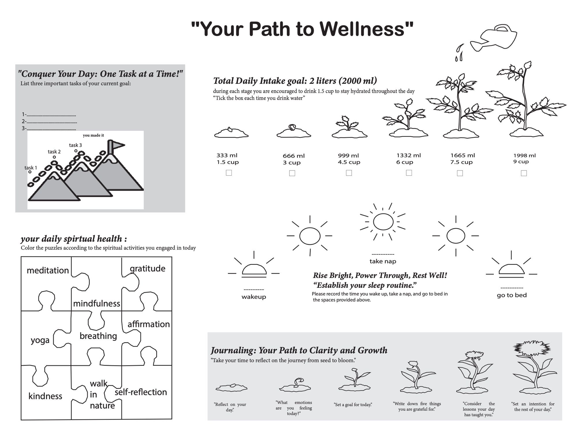
I interviewed two students about stress and staying organized, found that what works is different for everyone, and designed a printable planner that makes self-care visible through simple metaphors: a mountain for tasks, a growing plant for water, a sun for sleep. Two people tested it for 24 hours, and I reworked the layout based on what they told me.
Listening first
The brief was to design a paper tool that helps students manage day-to-day life as a whole, not just a redesigned calendar. My two interviews kept coming back to the same pressures: clubs, packed schedules and coursework. People coped through hobbies, breaks and friends, and organized themselves in very different ways, from journaling to Google Calendar.
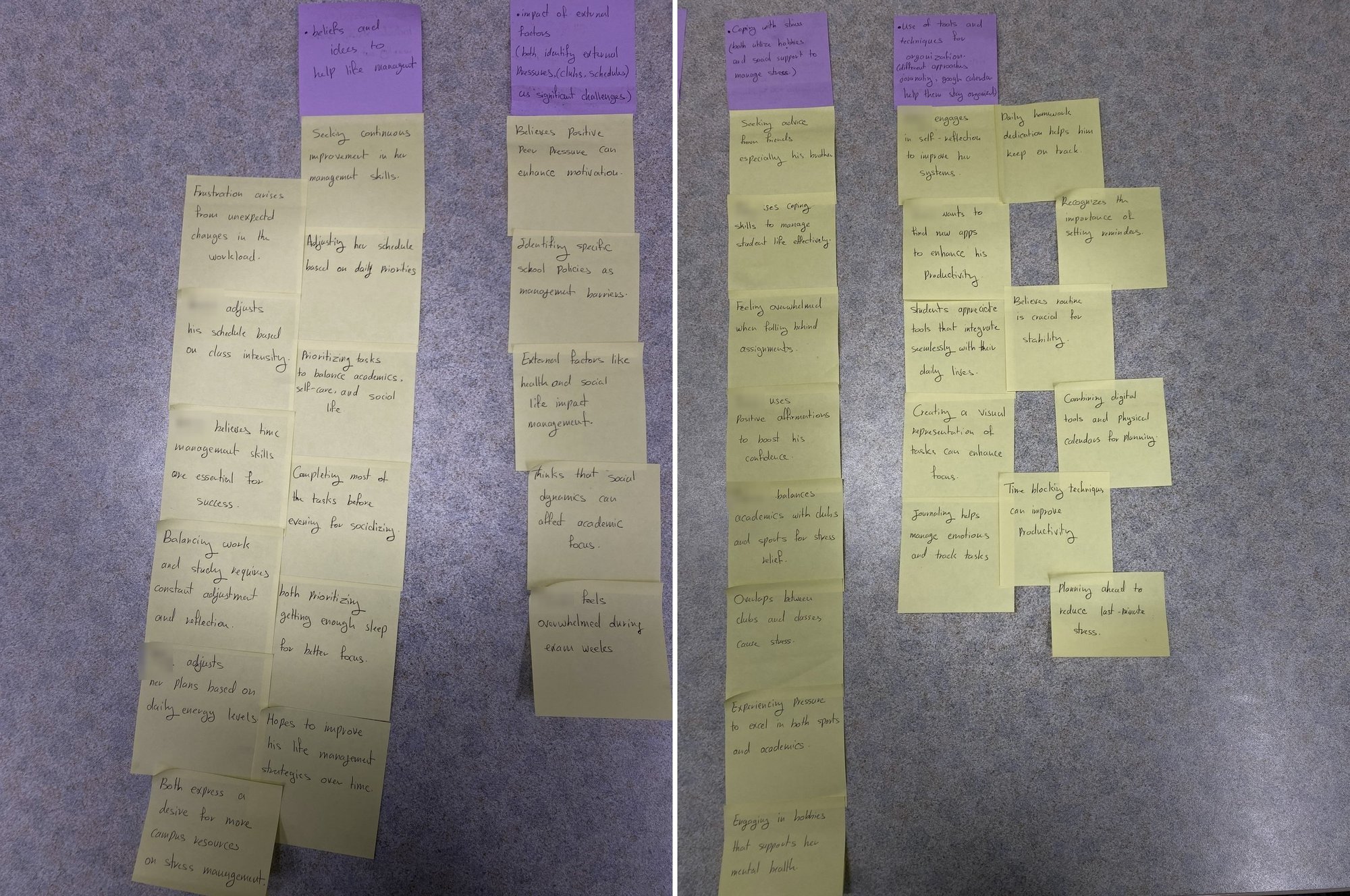
I wrote two insight statements:
- Managing stress. Students manage stress through hobbies and support from friends, so opportunities for social interaction and leisure play a crucial role in their well-being.
- Staying organized. Different strategies work for different people, so students need flexible tools they can tailor to themselves.
“I knew I needed to design a tool that could help students manage their academic and personal lives, without adding to the stress.”
Three questions to design for
I turned the insights into three How Might We questions:
- How might we create customizable organizational tools that cater to the diverse preferences of students, enhancing their ability to manage responsibilities effectively?
- How might we encourage students to integrate leisure activities into their busy schedule to improve their overall well-being and academic performance?
- How might we design social interaction opportunities that help students manage stress while balancing academic demands?
My brainstorm included habit tracking, gamified planning that rewards finished tasks, weekly reflection prompts and visual dashboards. Those ideas ended up in the final: habits you can track, visuals that reward progress, and prompts for reflection.
Metaphors you can see
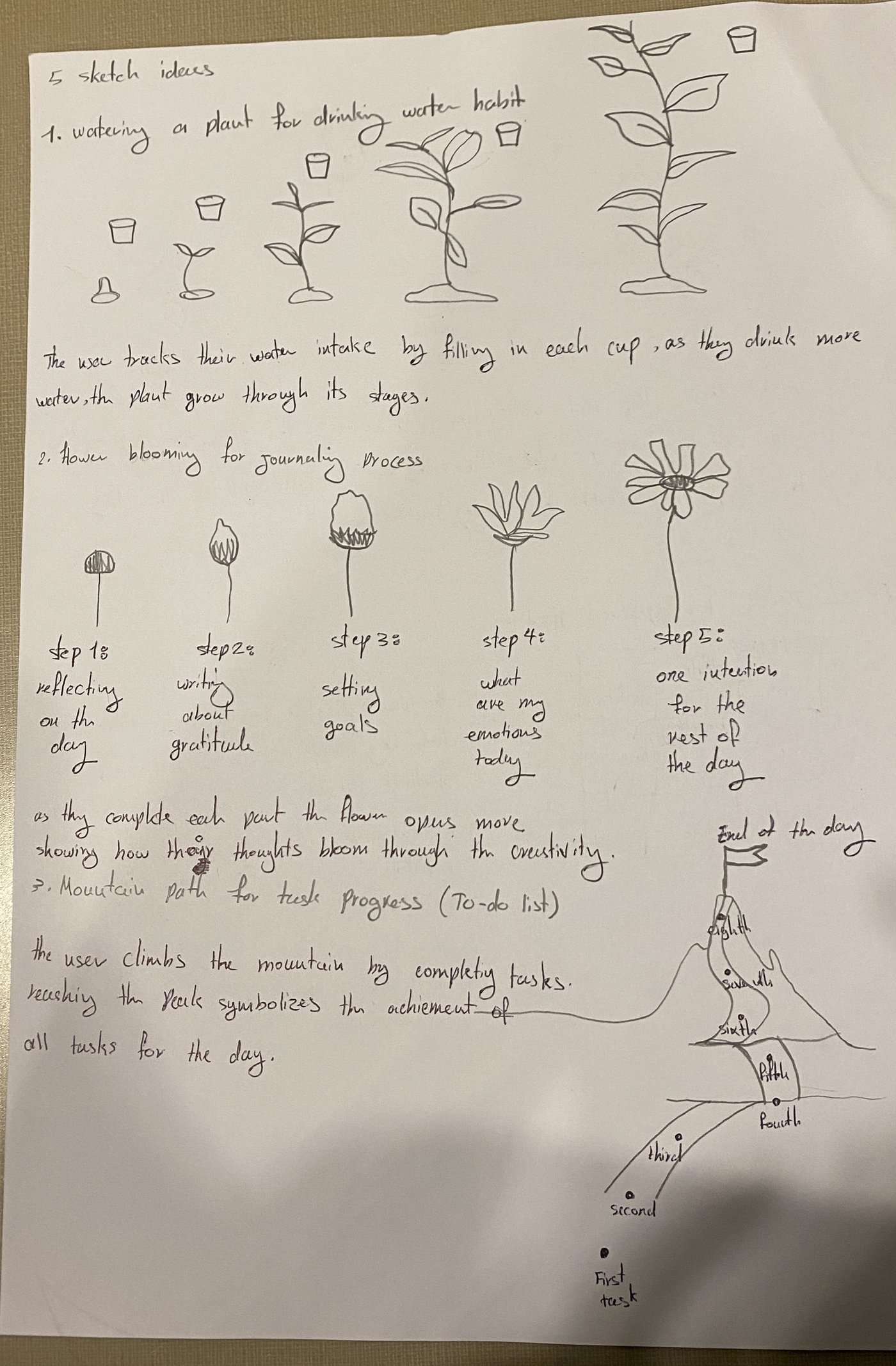
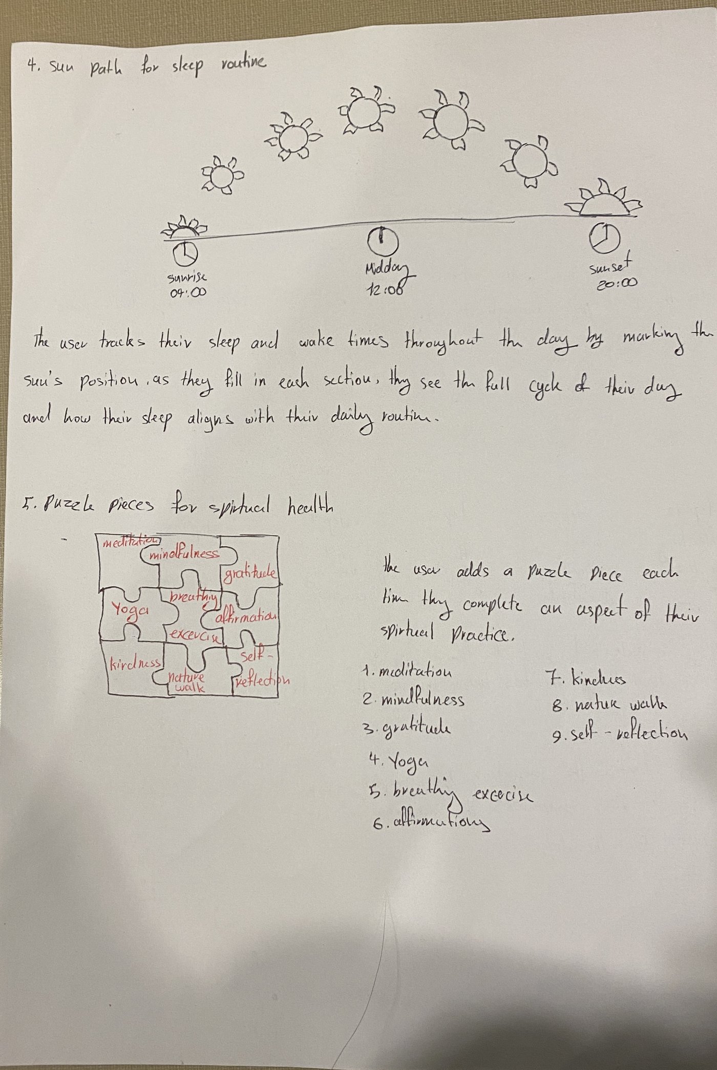
I sketched a visual metaphor for each habit: a plant that grows as you drink water, a flower that blooms as you journal, a mountain path for tasks, a sun’s path for sleep and puzzle pieces for self-care. For the mountain, “the user climbs the mountain by completing tasks. Reaching the peak symbolizes the achievement of all tasks for the day.”
Iterating the layout
I laid the planner out in Illustrator and went through seven iterations before the final, from a portrait page of stacked bands to a landscape layout with grey panels. The brief kept it to one 8.5×11 page in black, white and grey, with no photography.

- Proximity and alignment. “I moved things around to make sure the text and sections were closer to where they needed to be. It helps make the planner feel less chaotic and more straightforward.”
- Background and contrast. “To avoid a cluttered feel, I added light grey backgrounds in some sections.”
- Negative space. “I made sure there was enough white space around the sections.”
A 24-hour test
Two people used a printed copy for a full day with no instructions, then talked me through it. They liked different parts, and each found something that didn’t work:
| Section | What worked | What didn’t |
|---|---|---|
| Task mountain | “It felt motivational, as if I was climbing toward my goal with each task.” | Three task spaces felt too rigid. |
| Water plant | “The clear stages felt rewarding to check off.” | “1.5 cups” per stage was a bit abstract. |
| Self-care puzzle | A fun, interactive way to engage in self-care. | Not all nine activities fit one tester’s routine. |
| Sleep sun | A visual reminder to keep a consistent sleep schedule. | Redundant for a tester who already tracks sleep on their phone. |
| Seed-to-bloom journal | “The metaphor of ‘seed to bloom’ made journaling feel more meaningful.” | Nothing raised. |
After the test, I brought related text and sections closer together, adjusted type sizes so the important information stood out, and gave crowded areas more room. Those were layout and readability changes. The bigger requests, like swapping activities in and out, stayed open.
The final planner
“It became all about balance between work, play, and rest.”
What the testing left open
- Let people swap self-care activities in and out, which is what my second insight called for in the first place.
- More flexible task spaces than three fixed slots.
- A clearer water goal than “1.5 cups” per stage.
- Sleep quality, not just times, so the section adds something a phone tracker doesn’t.